The “decorative arts” – that sounds somehow frivolous, insubstantial, light-weight – utterly unlike the grandeur of the Louvre around the corner, where the much-celebrated (mostly male) figures of the French arts are displayed in all of their glory. Perhaps that why the new Museum of Decorative Arts has been left, in large part, to the women. A focus on the domestic helps to provide the space for them to flower, even take over, as the history of interior life of France, and Europe, is told in a detailed chronology of changing style and lifestyle.
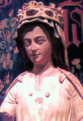
That begins in the first room, as the Middle Ages are turning into the early modern. There’s a lovely 14th-century stone Virgin, holding a serious-looking manuscript. This is a serious, considered, intelligent Virgin, not the vacuous innocent as she’s so often portrayed.
That still feels very medieval, but the lives of women and men were becoming increasingly sophisticated. An armoire dated to 1510 (the time of Louis XII) has linenfold side panels that evoke the Late Gothic but foliate panels and arabesques (showing Italian influence after military campaigns there) on the front and 16 images of men and women in extravagent hats and dress reflect new taste for luxury. This spectacular piece also marks the evolution from the medieva chest, which had been the most important furniture item, used for storage, as a table, a seat and even a bed, to the double-layer armoir, which held much more.
But some things took a while to change – a bed from the end of the 15th century is, to our eyes, very short, and piled high with pillows. That was since people slept sitting up, since lying down was identified with death – as in the depiction of tomb figures. (So when we say of those “they look like they are sleeping”, that’s not what would have been thought back then.)
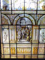 If that sounds like an uncomfortable night’s sleep, you could at least wake up to the sun streaming through beautiful stained glass. As with this lovely 1543 example from the workshop of Dirck Crabeth of Leyden, it was not just used in churches, but in universities, hospitals, chateau, houses and even inns. This example has religious motifs but glass was also produced with very secular themes, often playing on aspects of the owners’ coat of arms.
Not to say there are not plenty of hideous things here – in a room with some lovely, considered if austere chairs from the School of Fountainebleu, which was hudely influential in establishing fine Renaissance styles, are a set of six elaboratedly shaped and carved chairs. Their backs are formed by naked women; from Venice in the 16th century they fit the “hideous” bill perfectly. Tastelessness is not a modern phenomenon.
But in a lovely room full of small portraits – even royalty originally only got this size, since portraits were displayed only in cabinets of curiosity, not as room decoration – it is back to the real women, specifically with a focus on Marie de Hongrie, Queen and Regent of Netherlands, known as la protectrice des arts. This is no masterpiece, said to be a copy of a lost Titien, but it is said that she had a lot of influence in bringing the expression of the Italian Renaissance to the Netherlands at the start of the 16th century.
And the world just keeps getting more complicated. In the late 17th century there is a sudden appearance of new forms of furniture – desks, chests of drawers, small tables. Older ideas, however, cling on in odd ways: the French word “bureau” comes from word bure, the term for a cheap form of wool that was used to cover writing desks and protect from ink stains.
And once things starting getting fancy, with the Rococo, they go really over the top. On display is “probably the largest chest of drawers in existence”, a 3m-long monster created for Marie-Anne de Bourbon, Princesse de Conti, the illegitimate daughter of Louis V. A single piece of swirling red marble tops two sets of wavy drawers with end cabinets atop gold lions’ feet and with sunburst gold handles. You really would lose your “smalls” in the back of these drawers.
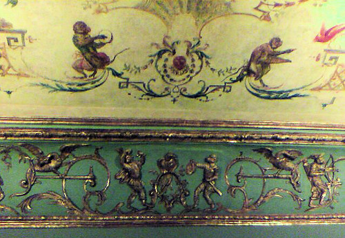
The style, emerging at the start of the 18th century, is perfectly illustrated by the decorated ceiling (below) from L’hotel de Verrue (c 1720). Whimsy is strong here – there are musical apes on the painted centre panel and hunter apes in the gold relief over the cornice. This was made for the fabulously wealthy salon hostess the Countess de Verrue.
Rococo took its name from fake grottos, but was modelled entirely on the shapes of marine environments. Freeflowing forms are seemingly always in movement; it is a total rebellion against straight, formal, classical forms. One small but supreme expression is in a sauceboat made by Jean-Claude Chambellan Duplesis; its handles are in the form of two waves, the sides lapping wavelets.
But there is some less studied pieces. Particularly notable among these are the light, monochrome paintings, little more than sketches, by Francois Boucher, who was the favourite artist of the king’s official mistress Madame de Pompadour. You can still almost see the artist creating the work, swishing brush over canvas.
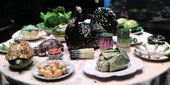
Dining rooms were not common in households until Louis XV’s reign. (And of course they are again disappearing.) Before then people ate in bedchambers or antechambers. But dining became very grand indeed, with each course having lots of dishes laid out according to plan prearranged by maitre d’hotel. This is marked by a spectacular collection of porcelain of a sort below, suggesting there was a meal on the table even when there wasn’t.
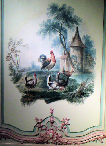
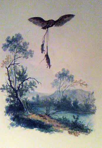
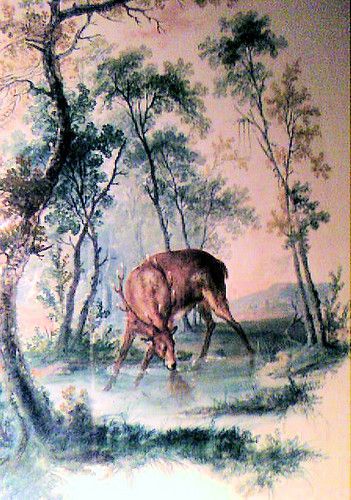
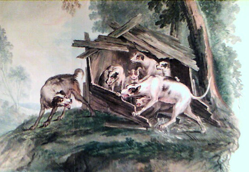
We’re moving now into a sophisticated age, and that’s clear from the spectacular “Cabinet des fables” of Madame Dange (her husband was Francois-Balthazar, Farmer-General). The complete room is reconstructed here from the family mansion in the Place Vendome, together with a video explaining the restoration process. On one side of the room the delicate pink framing has been returned, but on the other the gilding, introduced by 19th-century military men who found the pink a bit much, has been retained. The Fables of the Fountain have some resemblance to Aesop’s, being far from happy children’s tales, but have a real edge – nature raw in tooth and claw – that sits a little curiously with the polite gatherings you can imagine having once occurred in this room. (The story of the restoration is told here.)

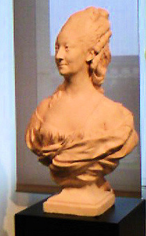
Inevitably, though there is a reaction against the “frivolous, unnatural” designs of the Roccoco, in the form of neoclassicalism. So you get this bust of Madame His by Jean Antone Houdon. As Marie-Anne Damaris Dumoustier de Vastre she married Pierre-François, an important German banker who also kept offices in Paris and Denmark. (This is 1774; globalisation, or at least European integration, seems to be in full swing.)
Excesses of Roccocco were gone, but the fashion for flowers, increasingly carefully observed from nature, remained, often combined with festoons of ribbons. The style was greatly popularised by the spread of wallpaper from the 1780, often in what was known as Etruscan style.
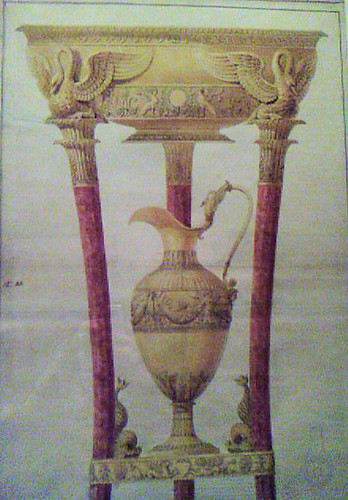
That light and attractive style seems, however, to have been overwhelmed by the arrival of mahogany in the late 18th under Louis XVI, as part of a craze for all things English. One of the oldest pieces here is a grand armoir from Toulouse. The tropical wood first being available in the port cities, it demonstrates that not all national fashion started in Paris.
The Revolution might have brought dramatic political change, and separated a lot of people from their heads, but in fashion terms the concern was all with ideal beauty: Neoclassicism ruled in the first two decades of the 19th century. It was austere and serene, glorying in Greek ideals of which the highest of course was democracy. The framework remained under Napoleon, but he saw himself as the patron of craftsmen and arts for economic purposes. There are echoes of Saddam Hussein in the comment that he showed off his wealth and power with a whole chain of palaces.
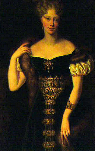
Things got duller when the monarchy returned, with an aged king. Again that left an opening for a woman, the Duchess de Berry, (below), who lived in and decorated this very wing of the Louvre. She was regarded as the leader of style of the restoration period, and followed much of the empire style in rich taste and Egyptian themes, but favoured lighter-coloured wood.
It was time, however, for fashions to circle again, so then comes a return to European inspiration and a new historicism, as represented by the elaborate French Renaissance-inspired bedroom of William Hope, a rich Anglo-Dutch banker, constructed 1820 in what is now the Polish embassy. You get of course, as in England, your neo-Gothic – no more attractive here than over the channel, and even sort of Neo-Rococo.
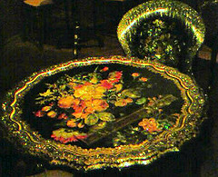 New technology also meant new possibilities, among them papiere mache furniture made from boiled cardboard and glue, poured into moulds, particularly in England and sold to the bourgeoise of Europe. All of their abundant cash went in the decoration, with mother of pearl particularly popular.
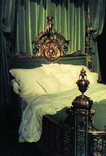
Not a great piece of design, but it’s after it that you get to my single favourite item in the exhibition – the bed specially made for the top courtesan in Paris at the end of 19th century, Valtesse de La Bigne For her grand home on the Boulevard Malesherbes. She was the model for Zola’s Nana, heroine of his most scandalous book.
No expense, or designer flourish, is spared – the patinated bronze is reminiscent of the gilt wood traditionally used for ceremonial beds (usually for royalty). The designer used the balustrade around the foot to enclose the amorous territory of the lovers that only the cupids in the headboard and leering fauns in the canopy have the right to behold. The cupids hold the courtesan’s pseudoaristocratic arms.
Zola described it as “an altar of byzantine sumptuousness” and that’s about right.
I could stop there, but the museum goes right on into the current day – indeed you’re most likely to find yourself next in the 2000s, which, it is proposed as being marked by a response to a lack of space with multifunctional, architecturally styled pieces. Well maybe.
You might think at this point that you have lost the 20th century, but when you take the stairs or the cunningly hidden lift (on the right) you get to the 1940s and work your way down the open tower. The first three decades of the century may be hidden here somewhere, but I didn’t find them. (It seems to be the current fashion in Paris museums to make navigation impossibly confusing – you might as well pick up the free map at the entrance, then you’ll be able to stare at it while still remaining puzzled.)
So the 20th century in short: the interwar period a conflict between modernism and reinterpretation of tradition; the fifties a period of austerity and lack of traditional materials meant simplicity and experimentation with materials such as wicker, leather and nontraditional European woods; eighties and nineties “the arrival of irony”. This was not a good thing for furniture, at least not if you want a chair you can sit on or a table you can eat off. You might as well go back to a good solid, multifunctional medieval chest.
Follow this link for the latest information on opening hours.